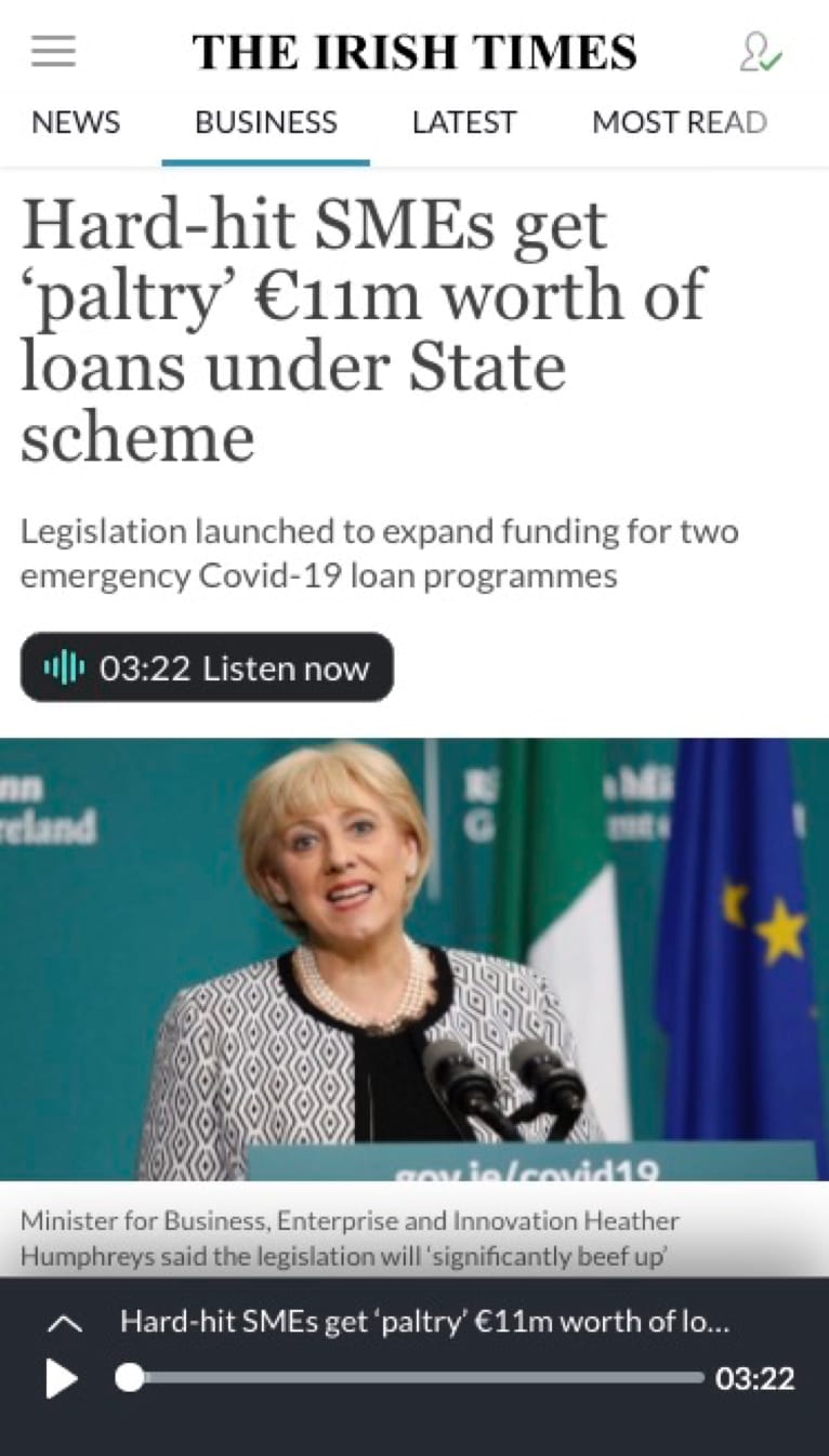
Imagine you are busy driving, commuting, exercising or you are visually impaired and you want to keep up to date with the latest news. "Listen" is a unique media service from The Irish Times, giving the readers the option to listen to text articles or podcasts. (see journey from homepage in the video below)
PROJECT SCOPE
In order to offer our audience the best possible experience, we felt that the audio player will need some improvement.
THE CHALLENGE
The challenge was mainly during the discovery phase where we had to pinpoint what exactly had to be change. We had some good ideas in terms of redesigning the UI, but first we needed to validate those ideas with real users.
TESTING
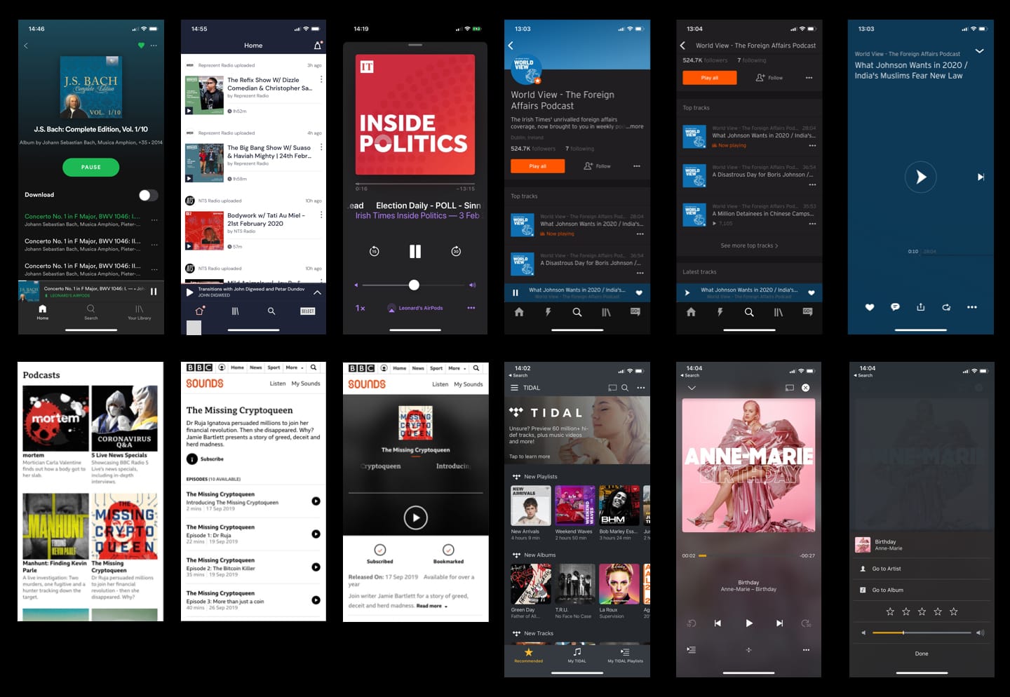
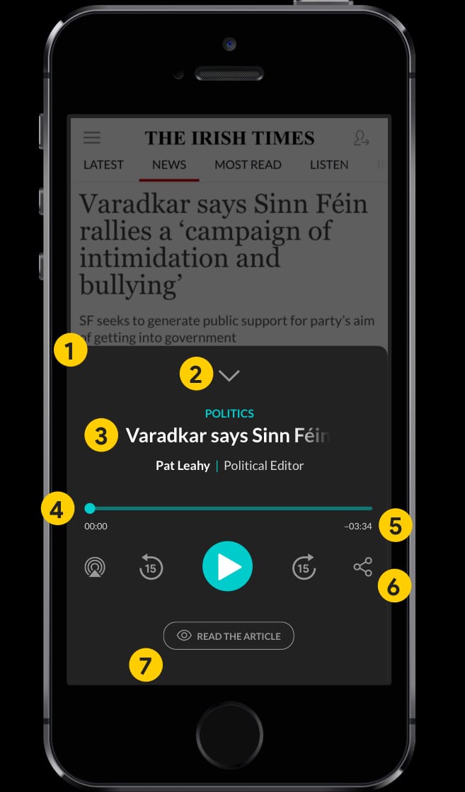
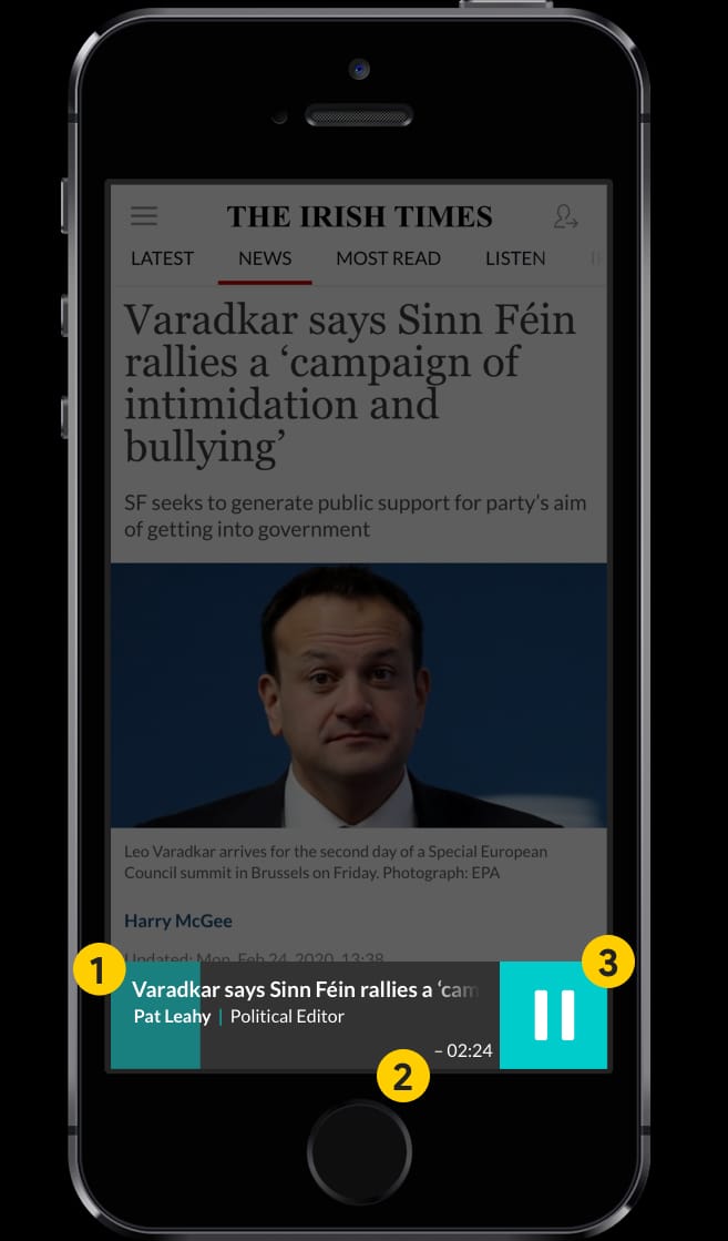
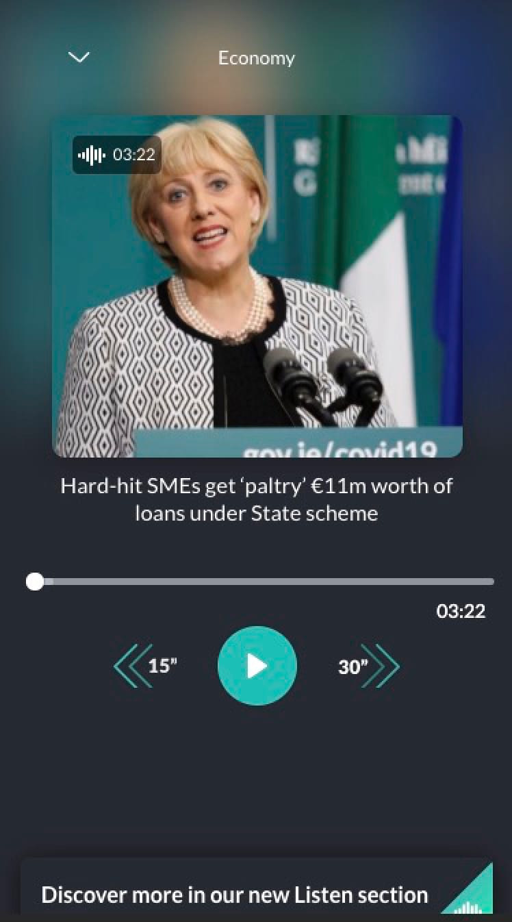
Before we created the testing scripts, we knew that some UI components were not easily recognisable as player controls. So we have created a B-version prototype using industry standard media player controls and a more user-friendly interface. Finally we conducted a couple of remote user-test interviews with Irish Times readers and readers of other publications with our primary goal to uncover any pain points that they were experiencing with the existing player but also validate some UI improvements we did on the B-version prototype.
WHAT WE WANTED TO EXPLORE
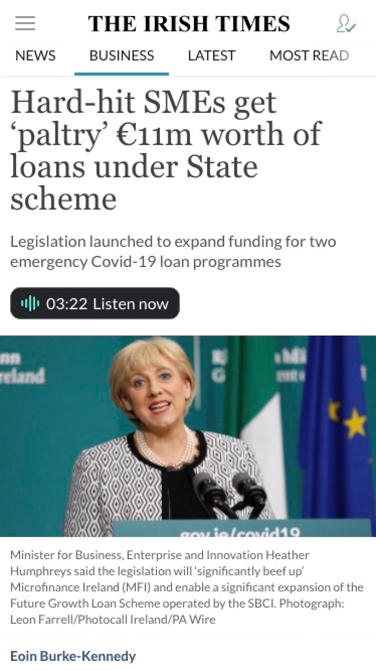
- Is it clear that by tapping on the”Listen now” button, the audio version of the article will start playing?
- What are the users expected to see if they tap that button?
- Is there a need for an image? The use of vertical space on mobile is paramount
- Is the drop-down arrow function clear to our users?
- Can we improve the progress bar
- Are double arrows function easy to understand? Do we need 15” back and 30” forward?
- Is the link to the “Listen” index easy to access?
- Does the player have to take up the full viewport screen when maximised?
- Do users have dificulties interacting with “Play” and “Maximise” buttons
When asked at the end of the test: “How would you describe your overall experience with the two versions?” some participants said:
"I found the second version (prototype) way beter" "Both versions were good but the second version was easier to use" "The second version is a bit more modern looking"