THE CHALLENGE
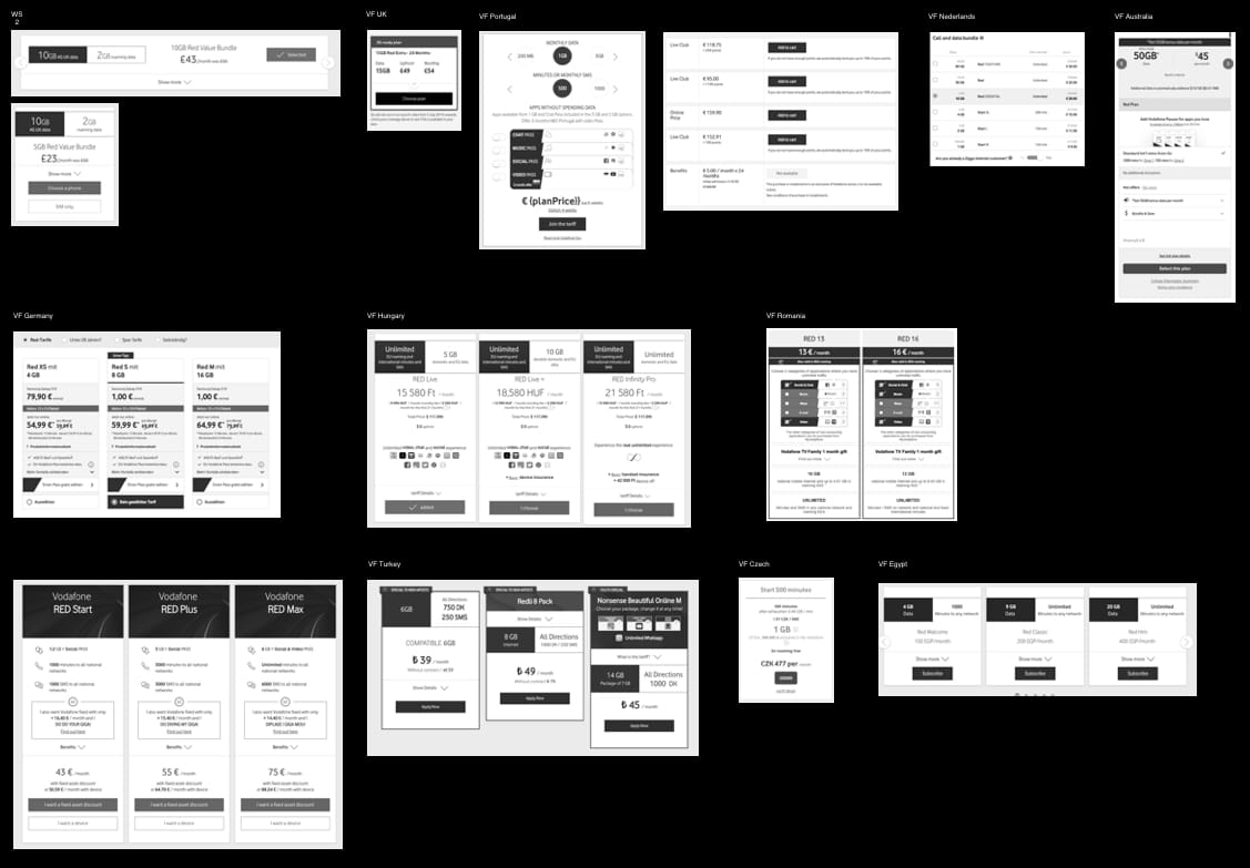
No visual and functional consistency when it comes to how different Vodafone markets show their offers. One reason for this can be the fact that each country is different in terms of offers, KPI’s, or even culturally speaking some visual elements (like colours) resonate better within the local markets than others.
Vodafone Group have provided each local market with a plans design template but we've discovered a few issues:
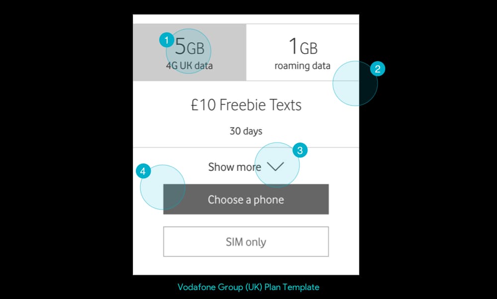
- In most moderated/remote user testing we did on plans pages, people tried to click on the USP’s thinking that they are tabs.
- Content hierarchy seems off. The name and price of the plan should be first, then its contents (like reading a book).
- The show more content is an addition to the main core plan specs. For most people the USPs should be enough to make a purchase decision, so why interrupt them by placing it above the CTA.
- Because a common Bill Pay journey requires the user first to choose a phone, then a plan, we need a way to display the phone’s price with this specific plan.
THE DESIGN PROCESS
Although the current state (described in the challenge) looks like a mixed bag, all plans have some key commonalities or shared features. These are: plan header, USP’s, call to action and the plan details..
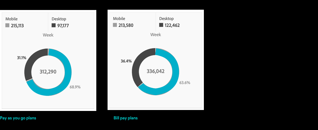
One key determinator in the redesign proces is the digital context or the medium where these components are being viewed by our users. Looking at the analytics on the PAYG and BP plans pages it was clear that, whatever we do, it has to be seamlessly optimised for mobile devices since the split in the past 6 months is ~70/30.
Other things we set out to do were to introduce simplicity through clear visual and content elements (such as typography and plan specs), information architecture, and last but not least an easily accessable call to action.
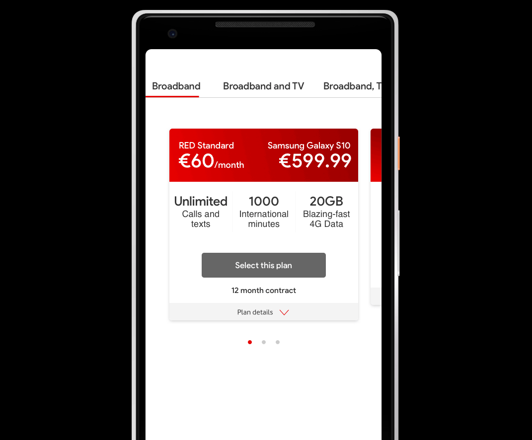
PLAN 2.0
We used a modula component based approach in building the new plan proposition using the 4 core element identified earlier in the process: plan header, USP’s, call to action and the plan details (animation below).

HEADER
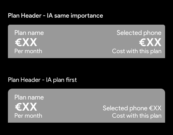
The plan header (mobile) will have 4 key content elements which we can rank visually: Plan name, price, phone name and phone price.
USP's
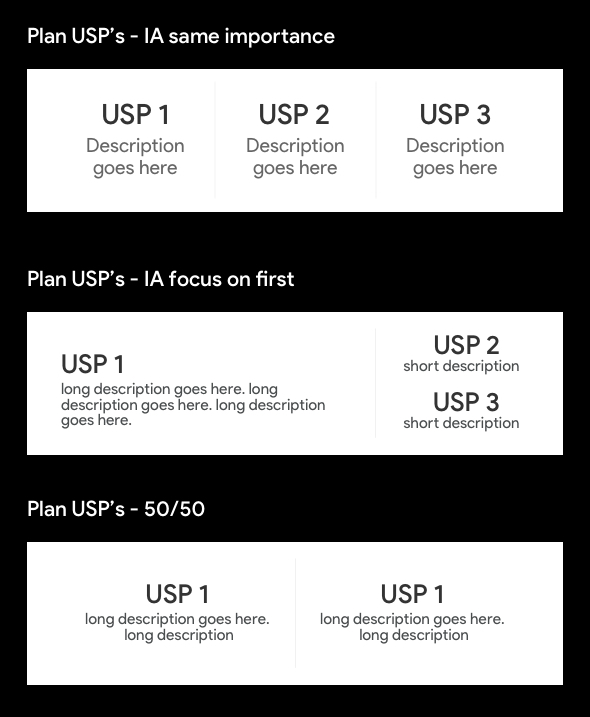
I think that 3 USP’s are enough to highlight what identifies a plan. The most common specs our users look out for are Data, Minutes and Texts, Extras. Each USP will have a title (likely a number/quantity) and brief description.
CALL TO ACTION
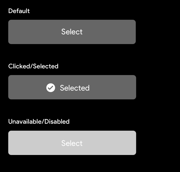
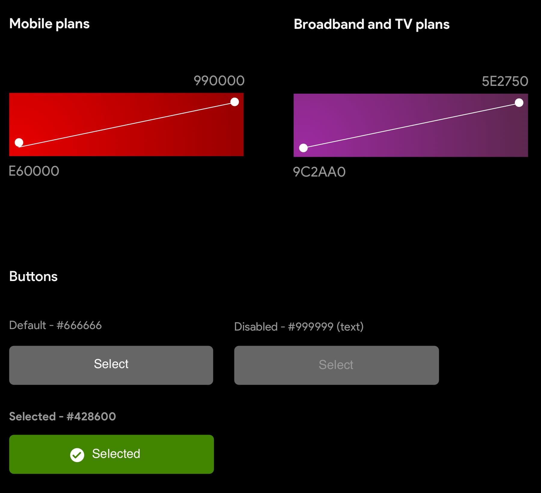
The call to action will have 3 states: default, clicked or selected and disabled. When a plan is selected, the cta colour changes to green and a tick icon will appear.
PLAN DETAILS
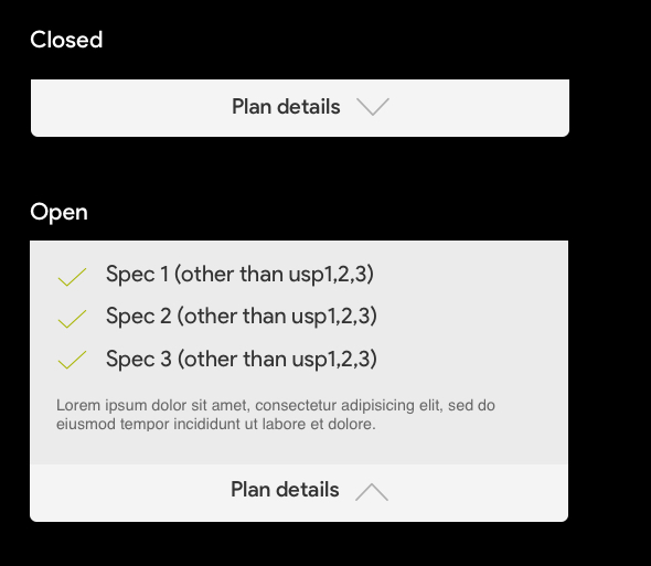
In the new plan design, the details are placed at the bottom of the plan’s card. The logic behind it is that the 3 USP’s could be enough for the user to make a decision, so adding details between the USP’s and the CTA might add friction. Another improvement is that we won’t repeat the plan specs in the details section, it will complement the USP’s.
COLOUR PALETTE
FINAL PRODUCT
Creating these plans is a evolutionary process whereby the final product is shaped over time though testing, gathering data, adapting and testing again. What we came up with is a solid starter point, a template, something we can start building on to.